Lettie Toujours Rebrand
When Lettie Toujour decided to grow her successful floral shop into a full-fledged space- and event-design service, she knew it was time for a full rebrand. I walked her through the creation of a full visual aesthetic and brand package that represents her vision, values, and story.
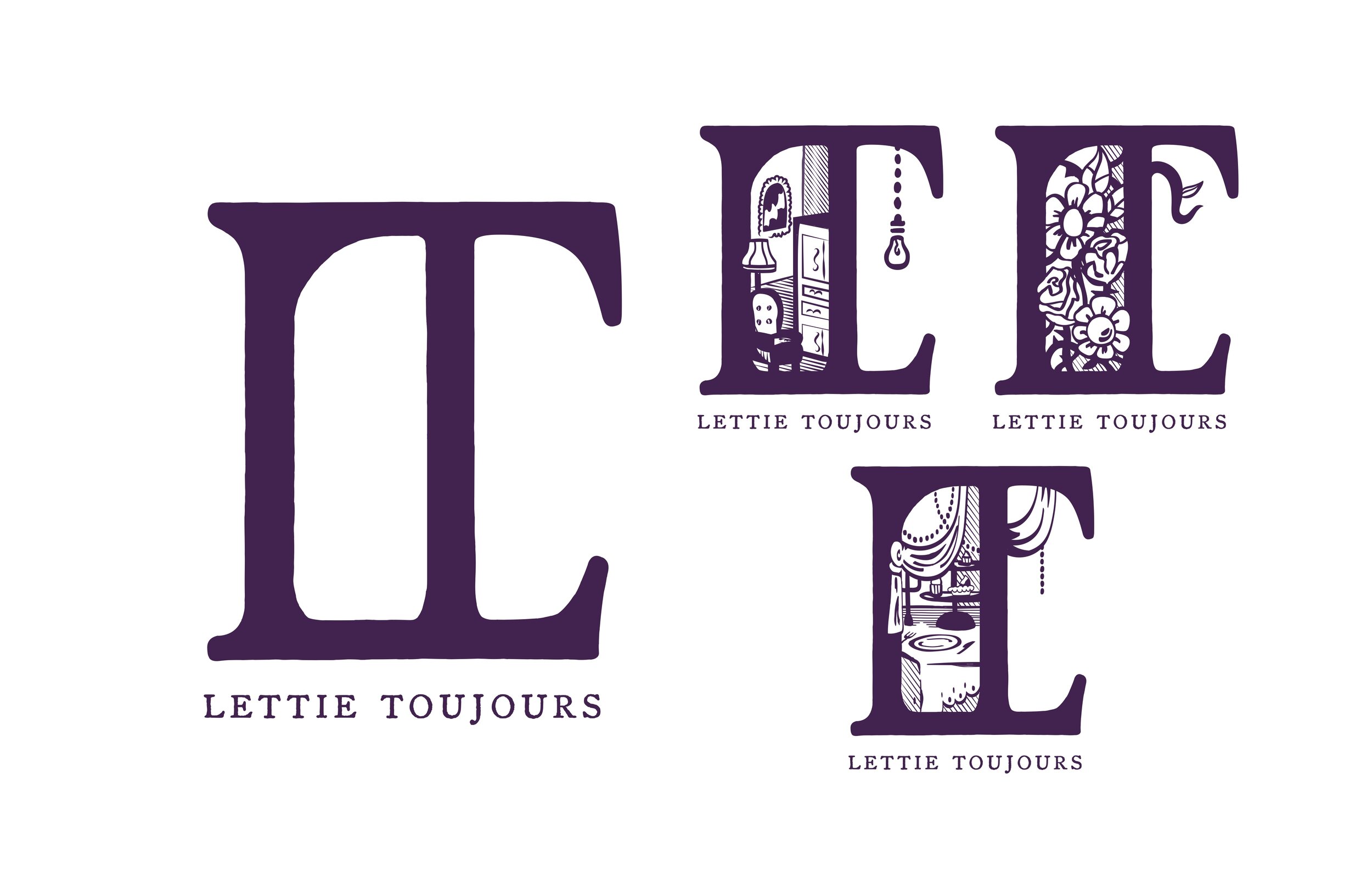
Drawing from a moody color palette of black, dark green, and eggplant, Lettie’s logo design was inspired by the hand carved block prints, rigid geometry, and swooping botanicals found in both the bohemian and Victorian design aesthetics she is drawn to. The logo pays homage to the company’s florist shop roots and represents the company’s growth, as symbols of its newly developed services seem to sprout like flours from the vines.

"When you are highly creative, it is sometimes difficult to convey your branding goals to designers. Working with Jacob was completely different. He took the time to get me and the nuances of my brand. He captivated, from scratch a beautiful and game changing identity—all the long staying true to our aesthetic. He was intuitive to what our clients loved best about us and what we want new clients to think about us. He gave to us an identity that is long-standing, stylish and sumptuous. I would have never thought such a beautiful identity would be realized for my brand, until Jacob."
—Paulette Still, Founder and CEO of Lettie Toujours Design Atelier